19 Dec Novelty, Not Boring Routine
Posted at 18:21h
in Corporate Culture, Employee Engagement, Employee Retention, Leadership, Talent Retention, Teamwork
CRANIUM POINT: Novelty, not boring routine.
Do the unexpected. Seek and reward innovation. Celebrate veering from conventional methods.
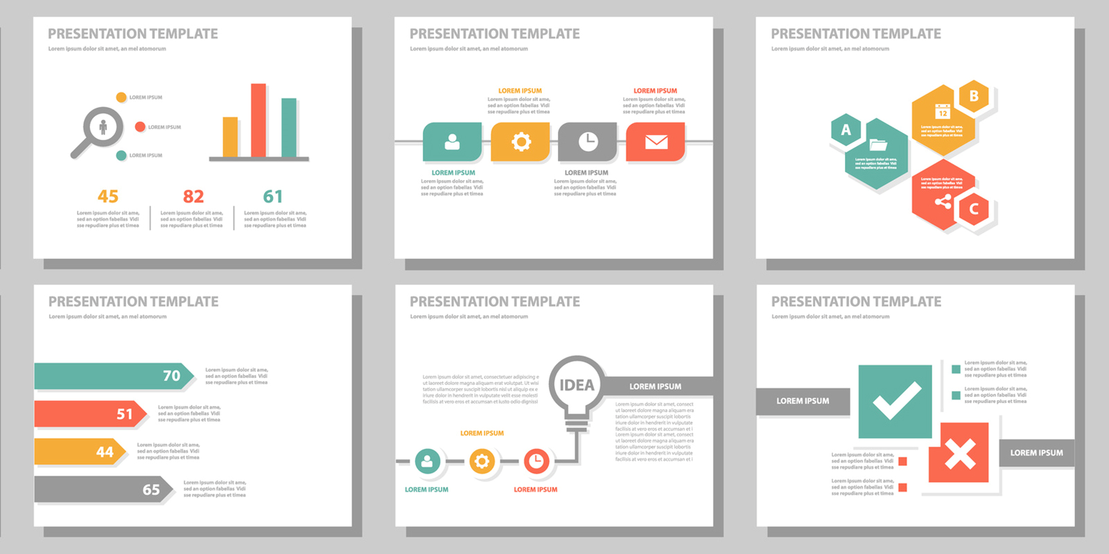
Normally, our novelty posts are a little whacky to emphasize breaking from convention. PowerPoint presentations are a good place to depart from this as they are often so bad. Why? Most often, it’s just an opportunity to be creative, and people go overboard. Channeling all that creativity into clean, simple, and clear graphics is not that hard if you follow some simple guidelines.
The brain gravitates toward clean, easy-to-read communication. Uncluttered communication with a clear message and supporting visuals is more appealing than heavy text and competing visuals. Clean. Simple. Clear.
- Black text on a white background is the gold standard for readability.
- Use 3 colors or less and use them sparingly.
- Graphics should be the centerpiece of your slides.
- Simple, conventional fonts (Times, Georgia, Arial, Helvetica) are the easiest to read.
- Save some information for the accompanying talk.